とりあえずプロットする
散布図を表示するにはplot()関数を使用する。
plot(x, y)
| 引数 | 説明 |
|---|---|
| x, y | プロットするデータ。 |
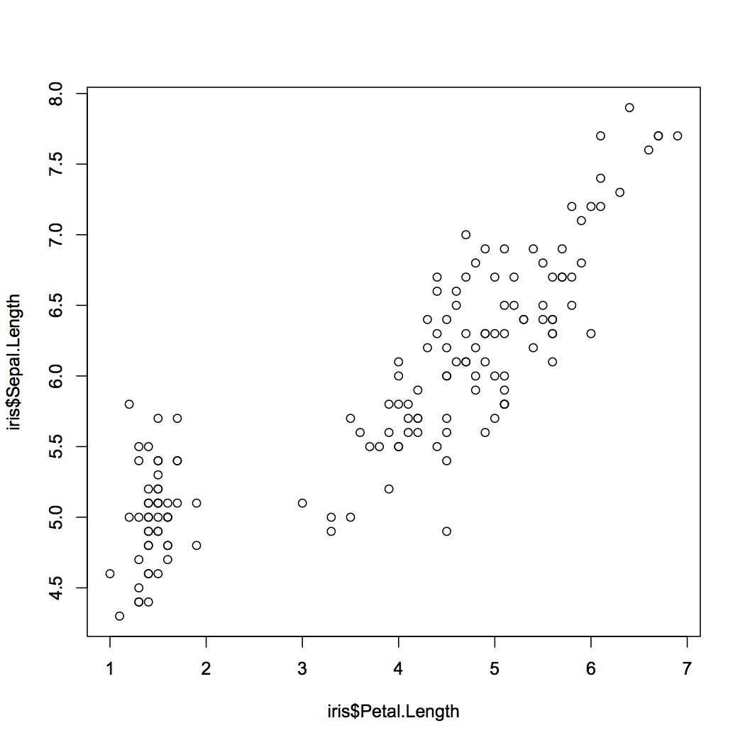
irisのデータセットを使用して散布図を描いてみる。
#irisのデータセットを使用する
> plot(iris$Sepal.Length~iris$Petal.Length)
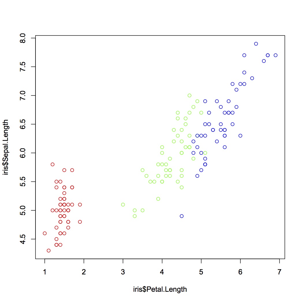
クラスごとに色分けして表示する
> plot(iris$Sepal.Length~iris$Petal.Length, col=c("red", "green", "blue")[unclass(iris$Species)])